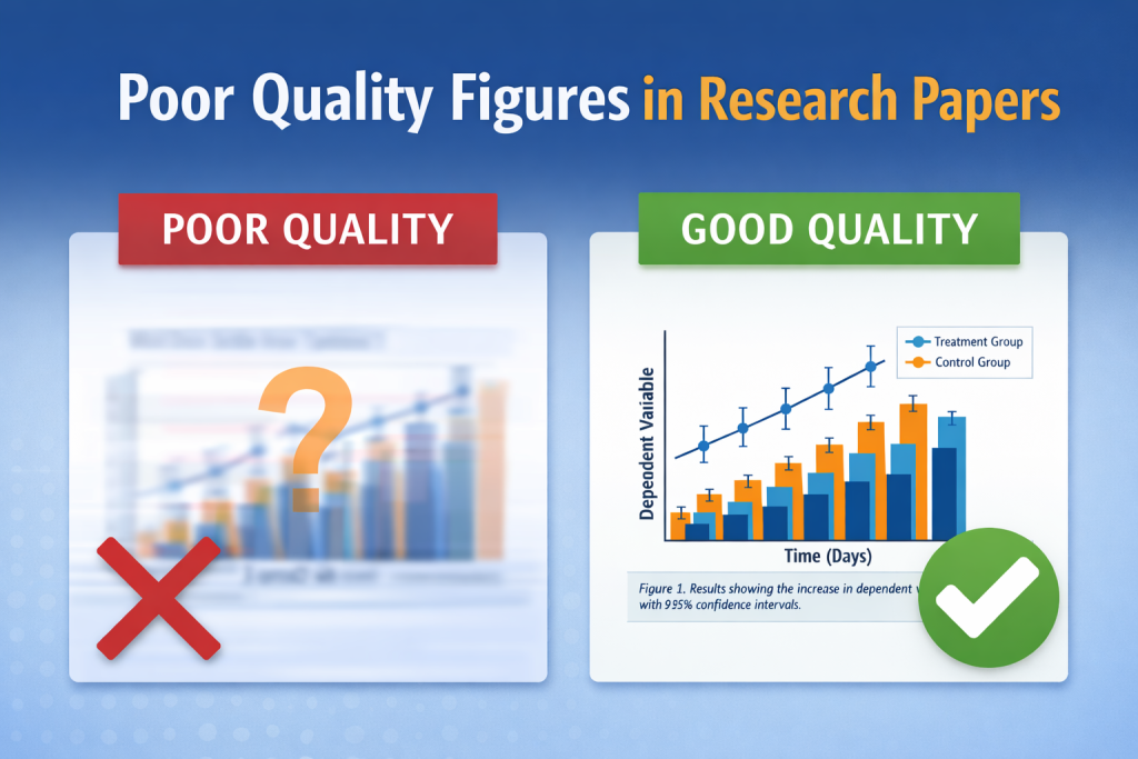
Most researchers obsess over their abstract, methods, and references. They should. But here’s the brutal truth: poor quality figures in research papers can destroy credibility faster than a weak discussion ever could. One confusing, pixelated, or misleading figure can make editors doubt your rigor and reviewers question your competence.
Figures are not decoration. They are evidence. They are arguments in visual form. If your visuals fail, your paper fails.
A strong figure clarifies.
A weak figure contaminates trust.
That’s why understanding what makes a good figure is not optional anymore. It’s a survival skill in modern academic publishing.
Why Figures Are Treated as Scientific Evidence
Figures compress complexity. They show relationships faster than text. They reveal trends that paragraphs struggle to describe. This is exactly why editors treat them as scientific proof, not aesthetic accessories.
When figures are sloppy, the science behind them is automatically questioned. According to the concept of reproducibility described in Wikipedia, research must be transparent and verifiable for others to reach the same conclusions. A poor figure blocks that process because it hides data structure instead of revealing it.
A reviewer doesn’t think:
“This figure is ugly.”
They think:
“If the data visualization is careless, how careful was the analysis?”
This is how weak figures silently sabotage good research.
What Is a Good Figure in Academic Research?
Before criticizing weak visuals, we need to define what is a good figure.
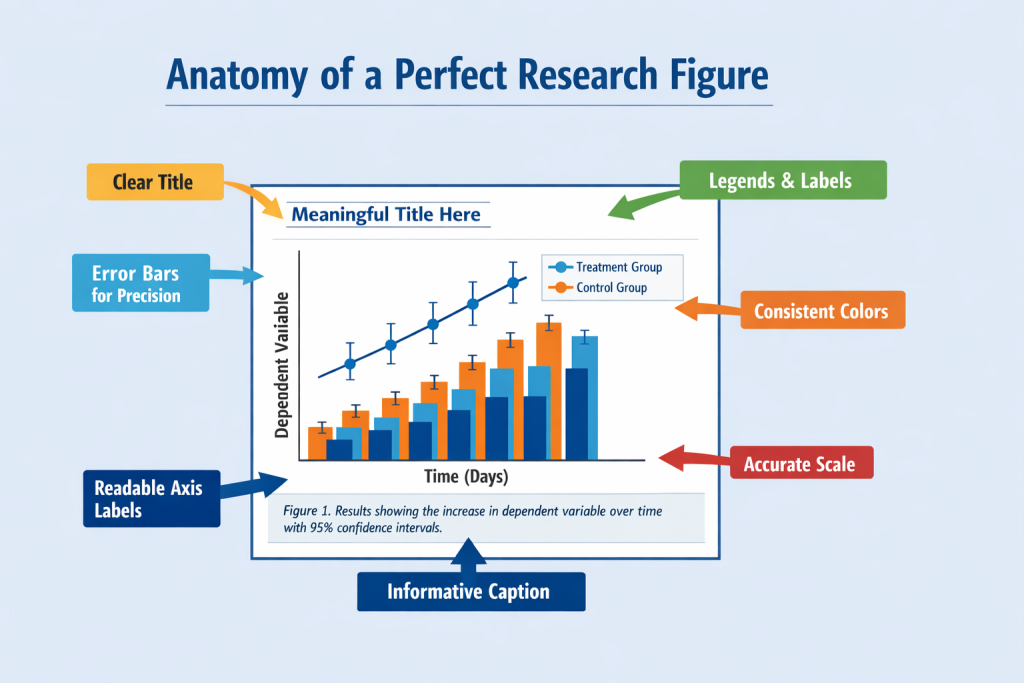
A good research figure is:
- Accurate
- Readable without zooming
- Self-explanatory with a strong caption
- Honest in scale and proportion
- Aligned with the research question
It is not confusing, nor exaggerate. It does not decorate.
According to general principles of scientific visualization explained in Research Methodology resources and commonly referenced in Wikipedia discussions on scientific graphics, a figure should communicate one idea clearly. One.
If your figure tries to show five messages at once, it shows none.
Poor Quality Figures in Research Papers: The Silent Paper Killer
Poor quality figures in research papers show up in predictable ways:
| Problem Type | What It Looks Like | How It Hurts Your Paper | Editorial Reaction |
| Low resolution | Blurry charts, unreadable labels | Data seems unreliable | Immediate rejection risk |
| Wrong scaling | Exaggerated trends | Accusations of bias | Ethical red flags |
| Overcrowding | Too many variables | Cognitive overload | Reviewer frustration |
| Missing legends | No explanation | Ambiguity | Major revision |
| Inconsistent style | Different fonts/colors | Lack of professionalism | Loss of trust |
This is not cosmetic. This is methodological damage.
What Is Research, and Why Figures Are Its Visual Language
Many early-stage researchers ask, what is research in its simplest form?
Research is a systematic inquiry designed to produce verifiable knowledge. Figures are the visual language of that inquiry. They translate raw data into interpretable meaning.
When your figures fail:
- Your inquiry looks unsystematic
- Your findings appear subjective
- Your claims lose precision
This is why strong journals emphasize visual integrity as much as statistical rigor.
On the ClinicaPress blog about common submission mistakes, it’s repeatedly stressed that weak presentation can outweigh strong data when editorial decisions are made. Editors judge what they can see before what they can calculate.
What Is the Dependent Variable in Research, and Why Your Figure Must Respect It
The dependent variable in research is the outcome you are measuring. Your figures must treat it with precision.
Common visual crimes include:
- Plotting dependent variables on inconsistent axes
- Mixing dependent and independent variables without labeling
- Using decorative scales that distort magnitude
These practices border on questionable research practices, a topic outlined on Wikipedia under research integrity discussions.
If your figure misrepresents the dependent variable:
- Your conclusions are visually corrupted
- Your statistical honesty is questioned
- Your methodology becomes suspect
A strong figure protects your dependent variable from misinterpretation.
What Is a Research Paradigm, and How It Shapes Your Figures
Your research paradigm (quantitative, qualitative, mixed-methods) determines how your figures should look.
Quantitative research requires:
- Precise graphs
- Error bars
- Statistical clarity
Qualitative research demands:
- Conceptual diagrams
- Thematic models
- Visual logic over numerical scale
Mixed-methods research needs:
- Hybrid representations
- Careful separation of data types
Confusing paradigms inside one figure is intellectual chaos.
ClinicaPress explains research clarity across multiple editorial guidelines, including their official Author Guidelines, where consistency and accuracy in presentation are emphasized as publication standards.
What Is Secondary Research, and Why Its Figures Demand Extra Care
What is secondary research?
It is research that analyzes existing data rather than generating new data.
Figures in secondary research carry extra responsibility:
- You must credit original data sources
- You must preserve original meaning
- You must avoid visual distortion
When figures misrepresent secondary data, you are not just careless. You are unethical.
Wikipedia’s discussion on the replication crisis shows how weak data interpretation has damaged trust in scientific literature. Poor figures are part of that damage chain.
How Do You Make a Research Proposal Without Weak Figures?
Many ask, how do you make a research proposal that feels credible?
You start by showing visual competence early.
Proposal figures should:
- Demonstrate analytical maturity
- Show preliminary structure
- Avoid decorative complexity
Weak figures in proposals signal:
“This researcher does not yet understand their own data.”
ClinicaPress’s guide on writing effective research abstracts highlights clarity of communication as a publishing advantage. The same principle applies to visuals: clarity sells credibility.
Why Editors Treat Figures as Integrity Indicators
Editors don’t have time to audit every dataset. They use figures as trust shortcuts.
Strong figures signal:
- Methodological discipline
- Statistical literacy
- Ethical awareness
Weak figures signal:
- Carelessness
- Potential data manipulation
- Low publishing readiness
That’s why poor quality figures in research papers are not forgiven easily. They suggest deeper flaws.
Practical Rules That Instantly Upgrade Your Figures
Follow these non-negotiables:
- Use vector formats (SVG, PDF, EPS)
- Keep font sizes readable at journal scale
- Label axes clearly
- Use consistent color logic
- Write captions that explain conclusions, not visuals
If your caption only describes what the figure looks like, it is weak.
It should explain what the figure proves.
Final Reality Check
You can survive a slightly weak introduction.
You can revise a discussion.
But one weak figure can sink your entire paper.
Poor quality figures in research papers are interpreted as:
- Methodological weakness
- Ethical carelessness
- Editorial risk
Strong figures, on the other hand, act as silent advocates. They defend your work even before reviewers read your methods.
That is power. Use it.