

Clinical research does not fail because of weak data. It fails because of weak presentation. Even strong results can lose credibility when researchers dump raw numbers into chaotic paragraphs. Presenting Clinical Data properly—through structured tables, clear figures, and well-organized supplementary files—is not cosmetic. It is a core part of scientific integrity.
Editors, reviewers, and readers scan papers quickly. They expect clarity, hierarchy, and transparency. If your data presentation forces them to decode information instead of understanding it instantly, your manuscript is already at a disadvantage.
Modern clinical publishing now demands a structured approach where the clinical data manager, clinical data analyst, and research authors collaborate to translate datasets into visual evidence.
Let’s break down how serious clinical papers present data in ways journals actually accept.
Why Presenting Clinical Data Correctly Matters
Clinical manuscripts are judged not only by the research question but by how evidence is communicated. Clear data presentation improves three critical aspects of scientific publishing:
- Interpretability: Readers grasp outcomes instantly.
- Transparency: Reviewers verify methodology without ambiguity.
- Reproducibility: Other researchers can replicate findings.
According to guidance from the World Health Organization, transparent reporting is essential to maintain credibility in global health research.
Poorly structured results often trigger revision requests, even when the data itself is valid.
For example, many manuscripts submitted to clinical journals contain:
- overcrowded tables
- duplicated figures
- missing supplementary datasets
- inconsistent statistical reporting
This is why journals emphasize standardized reporting frameworks such as those referenced in National Institutes of Health research transparency guidelines.
If you are preparing manuscripts for medical journals or platforms like ClinicaPress, structured data presentation is no longer optional—it is expected.
For example, authors publishing on http://ClinicaPress.com often structure their results similarly to guidance discussed in clinical peer review transparency practices to help reviewers navigate data quickly.
Tables: The Backbone of Clinical Results
Tables remain the most reliable method for presenting structured numerical data.
They allow researchers, including a clinical data scientist or clinical data coordinator, to present multiple variables in a compact and comparable format.
Good clinical tables follow three rules:
- One clear research objective per table
- Logical column hierarchy
- Footnotes explaining statistical tests
Example Structure for Clinical Trial Results
| Variable | Treatment Group | Control Group | p-value |
| Mean Age | 54.2 ± 7.1 | 55.1 ± 6.9 | 0.45 |
| Male (%) | 52% | 49% | 0.62 |
| Blood Pressure Reduction | 14 mmHg | 6 mmHg | <0.01 |
| Adverse Events | 8% | 6% | 0.32 |
Tables like this allow a clinical data analyst to summarize large datasets in a form that reviewers can evaluate quickly.
Many journals also require demographic baseline tables as the first table in clinical manuscripts.
Researchers working as clinical data abstractor jobs often prepare these tables when extracting information from trial databases.
To see examples of structured clinical result summaries used in journal publications, editorial discussions such as those referenced in clinical manuscript formatting guides show how editors expect results to be organized.
Figures: Turning Complex Data into Insight
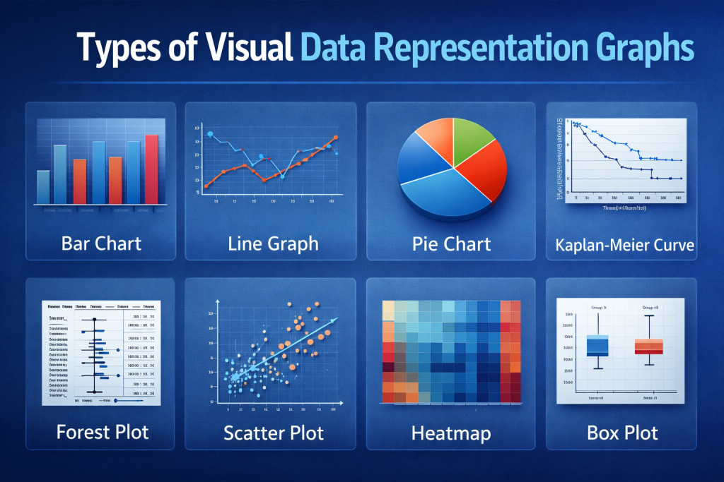
Figures transform statistical findings into visual patterns.
When done correctly, they allow readers to interpret trends in seconds.
Common clinical figures include:
- Kaplan–Meier survival curves
- forest plots
- bar charts comparing treatment outcomes
- scatter plots showing biomarker relationships
However, figures should never duplicate tables. Each visualization must add interpretive value.
According to the U.S. Food and Drug Administration clinical reporting guidance, visualizations should:
- display statistical significance clearly
- avoid distorted scales
- include sample size information
- label axes precisely
Figures are particularly valuable when explaining longitudinal outcomes, such as treatment responses across time.
Researchers exploring careers like clinical data scientist roles frequently specialize in creating statistical visualizations that support these analyses.
Many editorial insights on figure clarity can also be found in discussions around scientific visualization standards in medical publishing, where editors highlight common mistakes in figure design.
Supplementary Files: Where Detailed Data Lives
Modern clinical papers rarely contain all data within the main manuscript.
Instead, journals require supplementary files for extended datasets.
Typical supplementary materials include:
- extended methodology
- large patient datasets
- secondary outcome tables
- statistical code
- additional figures
This practice aligns with transparency standards recommended in Clinical trial reporting documentation.
Supplementary files allow journals to maintain readable manuscripts while ensuring full transparency.
Researchers working as a clinical data abstractor or clinical data coordinator often compile these datasets during the manuscript preparation phase.
Without proper supplementary material, reviewers may question whether results were selectively reported.
Some editorial discussions around data transparency in clinical publishing emphasize that supplementary files often determine whether a manuscript passes peer review.
Common Mistakes in Clinical Data Presentation
Even experienced researchers make avoidable mistakes.
Here are the most common ones editors flag:
1. Overloaded tables
Too many variables create confusion rather than clarity.
2. Unlabeled figures
Charts without proper legends or axis descriptions undermine credibility.
3. Missing statistical context
A p-value without sample size or confidence intervals tells an incomplete story.
4. Repetition across formats
The same data repeated in text, tables, and figures wastes journal space.
5. Poor supplementary organization
Datasets without proper naming or explanation frustrate reviewers.
Editorial teams often emphasize these issues when discussing best practices for manuscript editing in medical journals.
Fixing them dramatically improves manuscript acceptance chances.
The Role of Data Professionals in Clinical Publishing
Clinical manuscripts are increasingly collaborative.
Behind every published paper is usually a team that includes:
- clinical data manager
- clinical data analyst
- clinical data coordinator
- clinical data scientist
Each role contributes to the integrity of data presentation.
| Role | Responsibility |
| Clinical Data Manager | Oversees trial database integrity |
| Clinical Data Analyst | Performs statistical analysis |
| Clinical Data Scientist | Builds predictive models and visualizations |
| Clinical Data Coordinator | Ensures dataset documentation |
| Clinical Data Abstractor | Extracts structured data from records |
These professionals ensure that uc clinical data collected during trials becomes reliable evidence in published manuscripts.
In large clinical trials, the dataset may include thousands of variables. Without structured workflows, meaningful presentation becomes impossible.
Journal Expectations for Clinical Data Reporting
High-impact journals evaluate data presentation rigorously.
Reviewers often ask three key questions:
- Is the dataset transparent?
- Can readers interpret the results easily?
- Are the figures statistically meaningful?
Organizations like the International Committee of Medical Journal Editors recommend structured reporting standards that include:
- baseline tables
- outcome figures
- supplementary statistical files
- complete methodology transparency
These expectations are not bureaucratic hurdles. They protect scientific reliability.
For researchers submitting to clinical journals or editorial platforms like ClinicaPress, mastering Presenting Clinical Data effectively is one of the fastest ways to reduce revision cycles.
Final Thoughts
In clinical research, data credibility depends on presentation clarity.
Tables organize evidence.
Figures reveal patterns.
Supplementary files guarantee transparency.
When these elements work together, research becomes readable, verifiable, and trustworthy.
But when they fail, even groundbreaking findings risk rejection.
The future of clinical publishing is moving toward data-rich, visually interpretable, and transparent reporting. Researchers who master this approach will not only publish more successfully—they will contribute to a stronger, more reliable scientific record.
And that is the real purpose of presenting clinical data correctly.